 Summary
This component shows a modal dialog that lets the user select a specific date. The date displayed in the text box protion of the component is the international yyyy-mm-dd format (year-month-day).
| Category | AS Date |
| Version | 1.0 |
| Complies with Xhtml 1.0 / 1.1 rules | Yes |
| Supported server programming languages | C# Visual Basic.NET |
| Output content type | inline |
When inserted on a page the component shows the following user interface. The dialog is not shown until the user hits the Browse button.
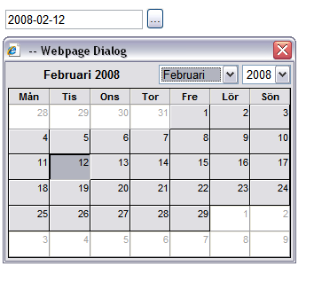
Date picker: dialog shown when the users hits the browse button.
When to use
This component is typically used when there in a form where there is a need to enter a date value. The dialog makes it easier for the user to enter a correct date.
 Programming interface
Parameters
- Field name and initial value
- Field name
- The name of the text box (input element) that stores the selected value
- Initial value
- The initial date value to be shown before the user has selected a date
- Appearance and behaviors
- ClassName
- A CSS class name that will be applied to the text box. The class attribute is omitted if no class is specified.
- Button css class name
- A CSS class name that will be applied to the button. The class attribute is omitted if no class is specified.
- Attributes
- Optional attributes that should be applied to the text box. ex. style="color: red".
- Button labels and settings
- Button text label
- The text to be shown in the browse button. The default value is ...
- Delete button text label
- The text to be shown in the delete button. The default value is Delete. This button, if shown, offers the possiblility for the user to remove the content of the text box.
- Show delete button
- Indicates whether the Delete button should be shown along with the browse button.
Remarks
This component works only in Internet Explorer version 6.0 or later.